My Sisters' Place

Responsive web design for individuals in vulnerable situations
Project overview:
Build a responsive website to improve the safety of survivors who visit a local domestic violence NGO
My role:
UX/UI Designer
Duration2/2/24 - 3/13/24
Tools used:
Figma, Miro, Whimsical, Maze
The problem:
A domestic abuse site offers a unique challenge in that it needs to protect the user from being caught while visiting the site. The original version had an ‘exit’ button in case the abuser walked in the room, but it was not very prominent and got lost in the clutter of the site. The original site also needed to be cleaner, and to offer easier and faster navigation to assist those who don’t have much time. It was especially cluttered on mobile, and the font choice was hard to read. It was also missing a major safety concern: it didn’t offer information about deleting search history and cookies upon entering the site in order to further protect individuals in danger.
The goal:
Clean up both the desktop and the mobile version of the site so that it is quickly and easily navigable in a seamlessly responsive experience, and make it safer for survivors to visit the site in the first place.
Link to Prototype

Design Process

Empathize

Introduction
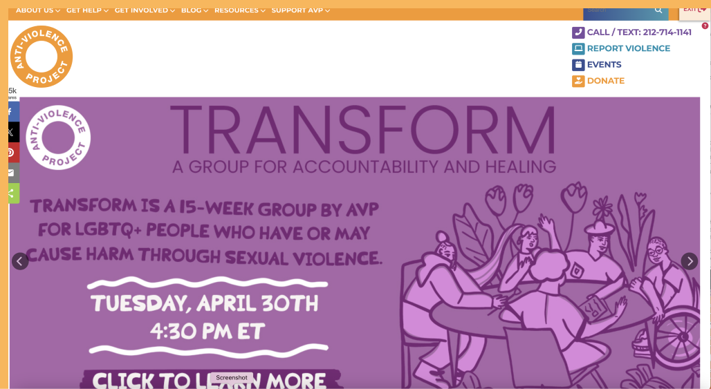
I was drawn to this project for two reasons: one is that my ultimate goal is to use my UX design skills for good in the world, and the other is because domestic violence websites have some very unique design challenges. For one thing, survivors need an ever-present panic button to use, so if their abuser walks in the room they can quickly escape to a google home page. Beyond that, the needs of both donors and victims must be merged together on one page: a singular space that has to address language barriers, accessibility issues, and create some kind of hierarchy in the process.
Competitive Analysis:
Since this would be my first time designing a site for a domestic violence NGO, it felt necessary to explore the multitudes of other domestic violence sites to try to find commonalities and effective examples of UX for this specific type of nonprofit. What I found was that there did not seem to be an established rule for domestic violence websites. Some provided modal pop ups with warnings about deleting search history, while others almost completely disregarded the need for user safety. The only universal constant I saw was the use of an exit/panic button.
Other domestic violence NGO landing pages

Click any image to view

Some sites had very poor organization and offered a wall of text, while others were beautifully organized into different cards and interactive features to make exploration of the site enjoyable. From the competitive research, I was able to establish several features to include for an ideal domestic abuse resource site:
The competitive analysis also showed a trend that most sites seemed to struggle with proper color use for buttons, and had issues establishing a manageable hierarchy that kept a focus on the most important items first.
User Interviews:
Given that my budget was $0 and my reach was limited, my research relied on asking interviewees to empathize and imagine certain scenarios vs. speaking with actual domestic violence victims. The interview was focused on “informational websites” and started out in a very broad place, only to ask domestic violence-specific questions at the very end.

My research goal was to get a better sense of how users interact with informational pages, what their likes and dislikes are when searching for something, and finally some insights into using a domestic violence nonprofit’s hierarchical structure - particularly because domestic violence websites have a lot of information & safety measures they need to include.
Starting to spot some immediate trends!

Click image to view

Key Takeaways:
1) imagery
2) up-to-date appearances
3) good organization
1) good visuals
2) good organization of information that doesn't overwhelm & is easy to filter
3) looking up-to-date and well-maintained
1) having to jump through too many hoops to get where user want to go
2) the site being overwhelming and difficult to navigate
3) having a bad flow where the user needs to aggressively hunt to find the information for which they are looking
User Surveys:
I opted to do a domestic violence survey using the Likert scale and binary response options, and using Facebook and Reddit to find volunteers. The seven participant responses echoed what interviewees said they appreciate in an informational website. Two users indicated a proclivity towards using keyboard shortcuts, which encouraged me to include a keyboard shortcut for the panic button as well. One user mentioned a distrust in privacy, leading me to think about how we might assure privacy protection and offer piece of mind.

Click either image to view

Ideate

Affinity Mapping:
Using Miro, I began to synthesize all of the feedback received in interviews and online surveys. With this, I was able to start making connections in perceived user needs and values.

Click image to view original work in new page

From this synthesis, I was able to draw a few lines as to how to proceed with the development of MSP.
What I opted to focus on:
  • make site look more up-to-date
  • offer clear organization, do not overwhelm
  • give a sense of establishment, community & empathy
  • make contact info easy to find and self-explanitory
  • make sure necessary pop up about deleting search history hits the right tone and is not inflammatory, as this is a turn off for many users
  • make sure to use captivating imagery
  • make site is easy to navigate and find items/categories
  • offer feedback from other survivors
What I opted to consider:
  • AI chatbot
  • how to incorporate incognito mode
  • slide arrow
  • special downloadable app disguised as something boring (dental app) where you can chat immediately with someone when in danger
What I opted to avoid:
  • putting anyone at risk - safety is priority
  • clutter/disorder
  • pressing users for information
  • making users jump through too many hoops to get anywhere
  • overloading site with content so it runs slowly
  • being too busy at top of homepage
Personas
Personas for this project were particularly weighty to conceptualize, as the situations that lead people to a site like this are so varied: there are victims in active danger, survivors from all different walks of life looking for legal guidance, donors and volunteers, as well as people who might not be sure if the situation they are in constitutes abuse and want to learn more. I made three personas: the person in immediate danger, the unsure victim, and the passionate participant (donor).
This exercise helped me to have a better understanding for how external factors, such as financial limitations, time limitations, and religious or peer influences might play a part in the lives of these users, and how those individuals might need a site like this to work.

From this exercise, I would make these site considerations:

Project Goals:
From here, I took the needs of users and compared against business goals and technical considerations. The most significant item of importance was user safety. Additionally important was not disturbing the pre-existing resources for abuse victims and donors (adding and not subtracting pathways). In re-designing the website, I didn’t want to throw off regular visitors from being able to make their usual choices.
Click image to view

Define

Problem Statement and Feature Set:
To begin the process of re-imagining the MSP website into a responsive, easy-to-use experience, I started with Point of View & How Might We statements to help decipher fitting design solutions. From there, I began to write down all the pre-existing features, as well as the new features I hoped to incorporate.

Click either image to view original work in new page

Site Map and User Flow:
Using Whimsical, I made a site map to offer a general idea of what all of the items from the list in the feature sets might look like in the updated responsive experience. It was important to not disrupt the mapping of the site too much from the original, as I didn’t want to confuse or deter regular visitors from the updated site, so I focused on adding pathways vs. taking any away. As you can see, the layout is very shallow to avoid users having to take too many steps to get anywhere on the site.

From there, I created a few user flows: Services and Outreach, How MSP Can Help, and How You Can Help. It was fun to put on my planning cap and think about all possible outcomes as users travel through the site, good or bad.
Click image to view original work in new page

Prototype

Lo-Fi Wireframes:
After some initial hand-sketching in my notebook, I had a pretty reasonable idea of how to proceed digitally. I opted to do two flows: one going to the Family Law page from the Home Page and one making a donation. Even though I was working in the lo-fi wireframes, I spent a lot of time thinking about how the language would be presented on the updated site, as the original site had a wall of text and I would need to carve out what needed to be seen from within this, as well as add new text to enforce the safety of visitors.

Click image to view
After some initial hand-sketching in my notebook, I had a pretty reasonable idea of how to proceed digitally. I opted to do two flows: one going to the Family Law page from the Home Page and one making a donation. Even though I was working in the lo-fi wireframes, I spent a lot of time thinking about how the language would be presented on the updated site, as the original site had a wall of text and I would need to carve out what needed to be seen from within this, as well as add new text to enforce the safety of visitors.

After a lot of consideration, I opted to design a fixed exit button at the base of the mobile page: it would have a partly translucent overlay as to relax the distraction from the page, but would remain a comfortable thumb click away at all times.
Click image to view
For the design of the desktop panic button, I decided to play around with white space and the grid system. I designed the desktop page with exaggerated margins and narrower columns to create plenty of white space along the side. With this, I was able to create a special place amongst the white space, giving the exit button a column of its own to live in that did not complete with any of the other content.
Click image to view
Eventually, I had my lo-fi wireframes in a place that felt like a solid foundation on which to build.
Click image to view
Logo Update and Brand Style Tile:
Before I began making design choices, I took a moment to think about key brand words to define the institution. They were:
As this organization is well-established, I wanted to remain true to some of their visions, including their logo, which I felt should remain recognizable for all who trust it. I did clean it up a bit, moving the illegibly small message to another location on the homepage and toning down the purple to something a little more soothing to the eye.
Click image to view
For the font types, I opted for Lato - a friendly but mature font style that is easy on the eyes - to set the right tone (I also used Nunito Sans to recreate the logo). From here, I began to think about color and icon options. I wanted to stay true to the established purple theme, but bring colors down to a more muted, relaxing tone. Even for the red Exit button, I opted for a soft red, as the color red and placement would be eye-catching enough - I wanted a hue that wouldn’t be so harsh it was distracting. From there, I picked out & designed Icons and buttons for the page (though I ended up changing the button colors during the design process as those wound up not looking quite right in practice.)
Click any image to view
Hi-Fi Wireframes:
It was finally time to take all of this prep work and execute a new design:
Click image to view original work in new page
One of the hardest parts of this design was getting the page headers & hero sections right. Due to the special placement of the Exit button, I opted not to do a full-screen image on the homepage, and to further complicate things, my original color scheme for this layout was running into accessibility issues, and took a lot of variations to get to a place that looked okay to me. On some of the other pages, I opted to add a full-page image at the top, but managed to come up with a creative solution that visually worked with the exit button: since these pages were less busy than the homepage, repositioning them didn’t interfere with the effectiveness of said Exit button. That said, it remained above the fold and highly visible for the user.
Click any image to view
Transforming this to mobile was also a unique challenge. Due to the sheer number of important buttons that exist on the home page above the fold (donate, translate, get help, exit site, give help, hotline, chatline) trusting that people will know to click a hamburger button didn’t feel like a safe bet. As the Exit button took the bottom space of the phone in a fixed position, I opted to add some additional navigation buttons at the top of the screen.
Click any image to view
Finally, one other notable challenge was converting the donation payment structure from desktop to mobile. On desktop, I had a three page click-through experience that a user could easily move through, however, on mobile this would be a cumbersome solution. Instead, I opted for a scroll solution that incorporated the same language and step process, but was more fitting of the mobile experience.
Click any image to view

Test

MSP User Testing Lo/Mid-Fi Prototypes:
I started with initial testing on my lo/mid-fi wireframes to see how the flow was working for users, if they were getting stuck anywhere, or if they had any confusion over the NGO offerings.Testing method: Maze prototype with follow up questionsResults: Overall, the six participants seemed to have a mostly easy time getting from start to finish with tasks, with a few exceptions. 100% completion rate but a few hiccups along the road. Overall I was happy with the speed, completion rate, and feedback.

Feedback that provoked a few changes to the design:

Click image to view
Hi-Fi prototype:
Once I had the hi-fi wireframes prototyped, I conducted some moderated user testing, using Google Meet and Figma to complete this portion.

Test Goals:
  • Make sure the flow of the prototype is intuitive to follow
  • Take note of any observed UI/visual flaws
  • Make sure to remove any redundancies/things that don’t make sense
  • Take note of any parts/language within the flow that seem problematic/unclear to users
  • Get general feedback about how using this product felt, and - having the user imagine visiting this site in an emergency situation - if they feel they would easily be able to get all the info they need
Results:
  • 100% completion rate
  • Fast completion with a few misclicks on desktop
  • User satisfaction was quite high - everyone seemed to enjoy using the page and no one had any issues with the pop up modal or exit button. 

Conclusions:
  • Overall, the prototype was in working order
  • Several users tried the pathway of “family services” vs “legal services” to get to the family law page (and one person attempted the “get help” button), which was understandable/expected based on lo-fi testing. I opted to build out multiple pathways to get to “family law”, including via “family services” and “get help,” so no matter what pathway they chose, the user would find what they were looking for. I had been considering also updating the language of the navigation itself, but in the end opted not to in order to avoid confusing pre-existing users.
  • There were positive sentiments over the pop up and fixed exit signs, which had been a concern to me given how intrusive they are, and how most people feel about pop ups.
  • Happily for me, no major overhaul was needed
Click image to view original work in new page
Conclusion